Design System for a Mobile Bank
Role
Senior Product Designer / DS Lead
Duration
2023 – 2024
Company
Anorbank
Challenge
Anorbank was rebuilding its mobile app from the ground up: new product leadership, new teams, and a legacy app that had been built fast and cheap. The design files matched the app: screens assembled from loose groups instead of components, colours mostly hard-coded as raw hex, no layout logic at all. The task was a full redesign of a live app with 4M+ registered users, rolled out piece by piece over a year. I owned the design system under that redesign and helped shape the design process around it.
Process
1. Concepts first, foundations in a month
- I started with concept mockups. Once the visual direction settled, the components practically fell out of them, and the core foundations were in place in about a month.
- The redesign shipped gradually, so the system could grow with the product: basic components first, the rest added as new flows demanded them.
2. Three-level tokens, chosen deliberately
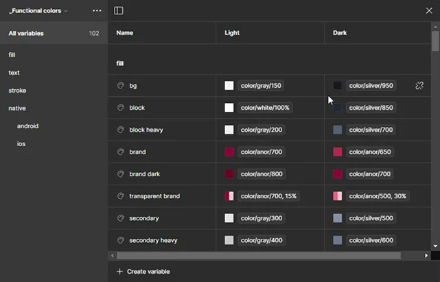
- Figma variables had just shipped and there were no playbooks yet. After studying how other teams structure tokens, I landed on primitive → semantic → component: a bit more setup than two levels, the same maintenance cost, noticeably more order and flexibility.
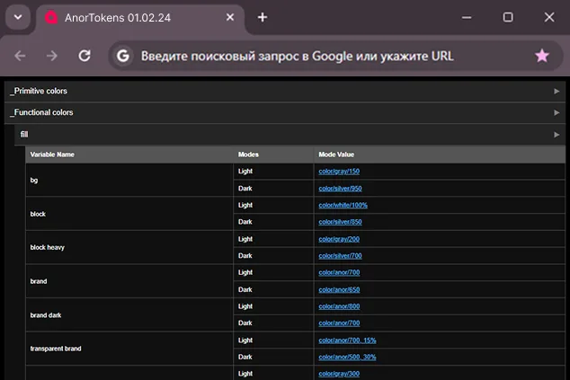
- Developers only ever touch the component layer: the iOS and Android teams pull a token collections file into their projects and bind to it.
- The quiet win was building greys on semi-transparent tints: components survive any background without spawning per-background variants.
3. Discipline instead of policing
- Every new flow was built strictly from the system: components first, then the flow. Nothing reached design or production around the design system, and within six months every new flow was assembled entirely from it.
- Each screen passed a checklist before handoff: self-check, review by another designer, regular team critique sessions, and the lead's review. Skipping the check happened only in exceptional circumstances, with the lead's sign-off.
Impact
- Component Adoption: Production screens went from a handful of reusable elements to ~90% component coverage — measured the direct way: in design, every screen is assembled from system components; in code, elements don't ship unless implemented as components.
- Efficiency: Feature design-and-build time dropped from ~4 sprints to 2-3 — visible directly in the team's sprint history.
- Onboarding Time: Cut from 6 weeks to 3 for new designers and developers. Developers felt it most: they were the larger group, and ready components made building screens straightforward.
- Bug Reduction: UI-related tickets dropped by roughly 40%, comparing ticket counts before and after the design system rollout. The system wasn't the only factor — the team and processes matured too — but it was the biggest deliberate change in that period.
A note on rigor: the bank's analytics covered customer-facing metrics, not internal delivery. These numbers come from Jira history, sprint statistics, and team observation — directional rather than laboratory-grade, and I'd defend the scale of each, not the second decimal.
Case Highlight: Automated Color Token Management
Problem: The evolving design system required frequent updates to the color scheme. Developers had to manually search for changes and update colors, leading to inefficiencies.
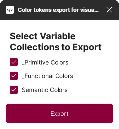
Solution: Proposed and developed a custom Figma plugin to export a table of color tokens in a convenient format with navigation. Eliminated the manual task of updating colors, simplifying updates for designers and developers.
Interactive Prototype
Conclusion
The most important decision in this project wasn't visual, it was sequencing. Starting with tokens and the most-used elements meant the team felt the benefits within weeks, not after a year-long rebuild. That early payoff is what made full adoption possible: by the time the system covered all new flows, designers and developers were defending it themselves. Looking back, I would invest more in documentation and the day-to-day usability of the system itself. That lesson grew into a whole direction of my practice, from the token-export plugin built here to Principal and DevPal.